Monday 12 December 2011

Final Evaluation


                          Final evaluation

My Final design for My materials techniques and designs was a photo-shop animation of a meteor destroying a planet showing off a large kaboom with the word kaboom afterward because are target was to creation one aimed at the word kaboom and how to show it off.

1 Be able to explore materials, techniques and processes safely

Using photo-shop was a lot harder to make an animation than using flash where I have had more time with using although it took me a while to get used to it I was happy with what I made in the short time I had.

Instead of using images from the internet I decided to use brushes to make land and add texture through more brushes and using the burn and dodge tool which would allow me to make it more realistic as-well as give me the skills of using brushes


2 Be able to use materials, techniques and processes

After I looked at some other peoples animations for kaboom it showed me how I could improve it and change it for the better like instead of making a meteor just moving I use a mix of blur and sharpen tools to make it look like it is moving at a very high pace

Whilst making the animation I only used my mouse and keyboard keys where I should of used a interactive tablet to draw with which would give me another skill as-well as being able to move the brush and other tools more flawlessly

3 Understand the suitability of materials, techniques and processes

The Research was done only on You-Tube where many animations have been done my thousands of people around the world with different styles and tastes where I choose one to research on feather which one based on call of duty

The only problem I had with my work was the ability to save it since the computer is normally slow it kept crashing so I had to save every half hour so I wouldn’t lose my work I had been working on ever so hard once I had finished the animation its self I added in some music and sound effects which would make it more interesting to watch instead of it being quiet and boring.


Connor Mcilroy -
Blog:
For the blogger there is a nice use of research and some experimental work, there are also placed videos to show what Jordan has done which gives a better perspective of what he has done instead of pictures. The layout of the blog is easy and assessable to use and there are no problem to follow the blog.
For the final:
I like the final video animation there are good uses of bright colours but I had some difficulty understanding the animation but I enjoyed it. The background use created by Jordan gives a greater feel to the animation and make the animation unique.  

Monday 5 December 2011

My Animation


This is my animation for my materials techniques and processes work with kaboom innovation and tradition in art and design, i did this video on photo-shop rather than flash so i could test myself between the differences of how it is all ran and the layout.

The process of this animation started with the use of creating a stage where the animation would take place in an enviorment that would make sense to the viewer .

Firstly making the space like image in the background was simply done but a star brush and in each frame i would increase the opacity of the stars to make it seem it was getting brighter and dimmer through out of the animation.

Creating the asteroid was a lot harder than it looks due to making it look like it was moving rather than a still image getting pulled across the screen which wouldn't look real at all and also wouldn't be a good animation so i took the color of an asteroid from the internet and added into to a ball and distorted it as much as i could and used photo shops animation software to make it seem like it was shooting across the screen into a planet i created with a brush with and coated over with the burn tool which gave it the planet like texture.

Because i didn't think my animation was good enough i deiced to add in a song which would distract the viewer from the animation and make them focus on the music insted.


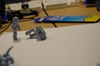
This is the group animation done by myself martin, Alex, Jake and will by the use of stock motion animation with blue-tack and a basic camera with tons of editing, we all took part in making the animation each with are own characters


the animation itself is rather short but making it took a good hour or two to get what we desired as a group we were happy with what we came up with but would make it a lot longer if we got the chance in the future.


Monday 28 November 2011

further research

 These websites show how use of patterns can be used to help improve the page layout and how the person reacts to the content of the image. this one has small squares through the layout although the second image has small different colored balls in a diagonal directions through he entire page which is extremely clear


  Personally i did not like doing typography because of how slow boring and time consuming it is as-well as i don't think it is my strongest skill out of the things we have done personally and to our blocks some people may find this easier than other things but id rather doing normal photo-shop editing

Monday 14 November 2011

Person tag

 For my personal tag i decided to make it as creepy as i can but still give it a childlike view so i decided to use the most populer colors in the 10-18 age range which consisted of red green purple and blue to give it a nice color and it would match the wording of the tag itself.


After resizing the image i placed  it on top of the image that i hand drew and recolored in photo shop to make it stand out more and bring it a more 3d effect , i experimented with many colors but i the end i decided to keep in the same similar colors of the clown i had done before.

Monday 7 November 2011

LO3 - EXPERIMENTATION

This is the base of are pattern and texture part of our course this perticuler image was the first to be done through a demo to teach us how to do it and then to do are own.

the way this is done is rather simple although it look very complex but it is only a series of copying and manipulating the direction of each image and simply merging them all together.


This is an image which i did on my own after the demo to see how i could manipulate the image using my own imagination and own color scheme.

using multiple types of font and colors can make completely different ways of manipulating images into patterns and textures such as brick walls, wood and many other things.


This is my absolutely best image for the patterns and textures because of the bright colors and how it looks 3d although it was not intended.

as-well as the lines connecting perfectly and having each line with different colors which show off the pattern well.

LO3 - RESEARCH

 the throbbing color of the red and orange mix texture in the background makes it look like a mutated blood stream, aswell as the logo in the foreground, it also makes it seem somethings going to come out of it.
The use of a black and white faded images as-well as the clicking layered images which are links, highlights of certain key points such as eyes and other key images and words. the texture of the image and using the sun over the horizon style with a soothing blue color which shows the metallic color of the title screen.

This image shows a vast amount of brushes and brushstyles as well as factoring his photography

There are a lot of bright colors onto of a dark background to show them off a lot more than having a bright background with bright foreground.


Banksy - his work is seen as vandalism through out the word by some people but the people who really see what his work is about see it as inspiration in their lives and inspires them to do their own work and try to be as popular as banksy himself. 
 This is personally my most liked image from banksys huge collection, Due to the selflessness in the picture of how people who have nothing do not think about them self's but about the world around them and if it really had change no one would be left out on the streets
Having this piece so close to my home town made me think about how where ever you go no matter how far your art can connect with anyone anywhere

This picture is showing a common factor through out the world of lovers getting caught by their partners which shows to the extreams of it happening for real.
its seems both  of banksy images are used as stencils and normally the same basic color through out unless he is trying to highlight certain aspects of any wording or a certain area of the image in this case the two colors that stand out seem to be the two people in the window as the man hanging out of the window with a white and black with a small amount of shading


This image of banksy himself in an documentary that was released many friends and fans of banksy were surprised to see him on film even though his face was blurred and actually knowingly let someone know he was banksy.

Banksys trust in the man that filmed this documentary was astounding and how he let him follow him around and be his look out although it was originally based on banksy it took a turn to the man that was filming as he enters the world of art himself and is known as Mr brainwash began making pieces of art and selling them.


DAVID CARSON – uses typography to create details images with the words on a keyboard which are highly detailed  and still shows what the original image is supposed to be he first started doing this with skateboard designs with his own company of which he sold and got offered a position with another small skateboard company called transworld skateboarding and he is the art director where he is a vital role in his spare time he still makes and sells images to do with typography which are highly profound by many in the art sector of the world  

 Animation - counterstrke - Basic stickman animation based on call of duty and how some players are during and throughout the game but made it more funny.

Camper - a person who stays in one spot during the entire game 
Hacker - a Person who illegally enters a game and changes it to their advantage .
Assassin - A person who is extremely skilled with any weapon in the game.
Dumbass - A person who runs in attacking without thinking.

The characters in this animation show aspects of how people act and react to on line video games such as call of duty and what may happen in certain situations such as lagging modding and other things most people find highly annoying and could also be illegal.


Each character shown here is a way of people acting during the game, the killer is someone who manages to kill almost everybody without getting killed themselfs.

This is a common person who runs around without thinking and shooting at everything that moves, they also almost get killed every single time in the game.


We were taken to astor park to get images of graffti to understand the idea of are own tags and how textures would and could effect out own tags


While looking through these images i couldn't think of anyway to incorporate them into my own design so i decided not to use them in this  part of my work but iv kept them in case i want to use them later in the future


Monday 31 October 2011

Demo


This process consisted of using the cloud filter repeatedly to make it as dark as we could in-till we were happy with the depth of color within it.
then we used the gradient map to choose the right amount of orange yellow and black to make it seem like lava like substance. we then put in some text and then rasterized it so we can then place it into an animation and became the process it is now >>>
dfhdfhdfhdfhdhdhdhdhdhdhdhdhdfhdfh


tfyh
 This is the source image for our demo of texture and patterns where on this one we used the center of the image the "cabbage vain" as an simpler image to manipulate for our first try.
Once we had cropped the cabbage we used the hue and saturation tool to change the color to a darkish sea blue as it will act as the main part of our final pattern
We then added in a single letter of our choice to use as an connection of each following image as they will begin to form a pattern.
once we had duplicated the image four times and changed them via the rotation tool mixed with the vertical or horizontal tool where it formed the pattern within it then easily copying to repeatedly to form a ongoing pattern
Once i had finally copied the image to fill the page there were still white from the orginal background so i decided to copy the image once again and drag it to connect to the nearest non white image to compleatly fill in the gaps and finishing the image .


                                                                  FINAL IMAGE

Monday 10 October 2011

being able to exsplore materials and processes safely


This was the process of being able to take an image completely out of its background without having to take unnecessary time or risk cutting the wrong parts of the image out.
 When i started to work on the poster i made multiple background so i wouldn't risk losing time if i made a mistake that couldn't be easily corrected in a short amount of time, i used a set of space brushes as-well as a set of lightning brush to make it seem like an electromagnetic black hole was opening as well as using the burn tool to lighting darken the grass
 after doubling the image of the black hole i made it upside to make it look more like a vortex as-well as adding fire into it by using the dragon fire brush set within the center of it to add to the effect
 Again i doubled up the fire image making it look more like a spiral and went over certain aspects to make them look as clear as possible

 Once i had fine edited wha ti had already done i put another image of a creature looking like it was moving to make it seem like its rushing through the black hole.

Monday 3 October 2011

3 Understand the suitability of materials, techniques and processes

This image was choose because i liked the blend of hot and cold (fire and ice) again i believe that it was drawn in detail as well in colored in detail too, it seems as if there are multiple layers for each character which would of made it easier to manipulate, if any mistakes are made they will be easily be undone.
I like this image because  of the colors that complement each other and its also an image with characters from an highly popular anime called bleach, i believe that the image was at first drawn by pencil then pen which was then completely edited by photo-shop to add color as well as texture and positioning to move the characters appropriately as well as making it three more three dimensional.


This amazing image was done on canvas with acrylic paint, this image has a fine amount of detail and a strong technique with the blending of colors using light amounts of blue gave a mist effect

2 Be able to use materials, techniques and processes

1 Be able to explore materials, techniques and processes safely